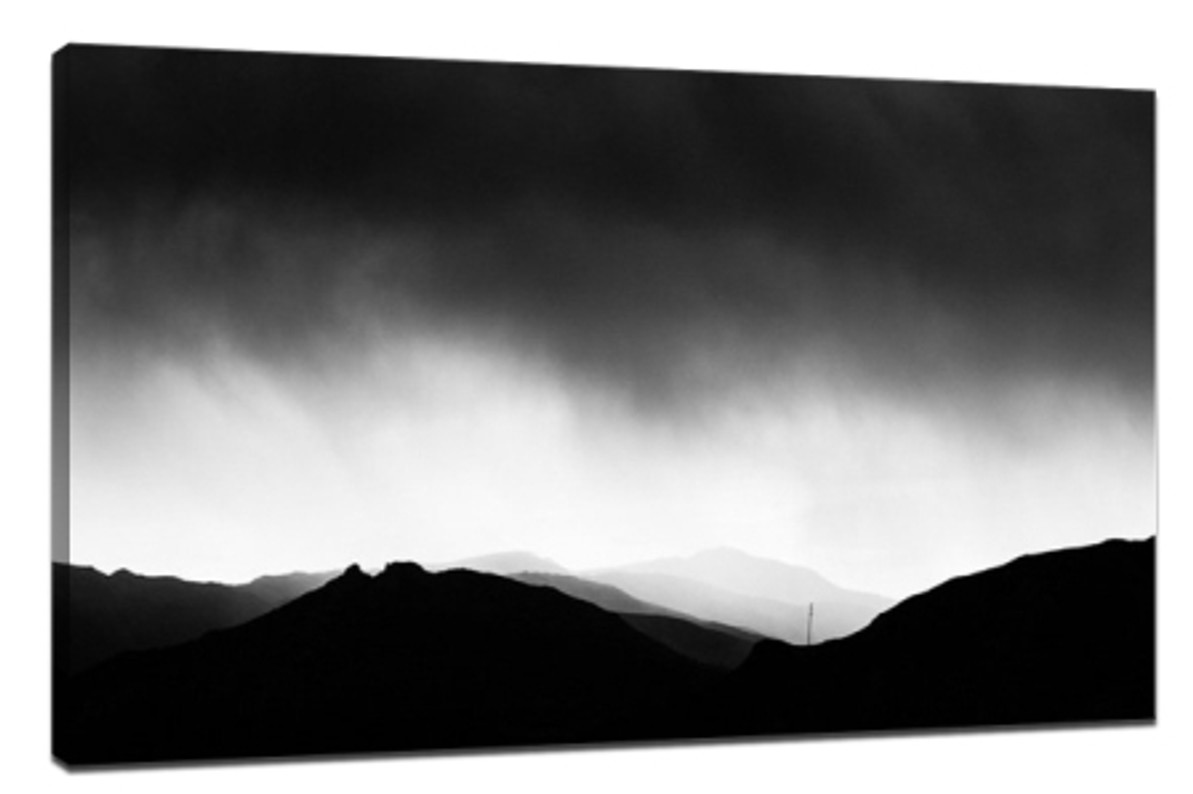
Use shadow and contrast to create tension of a photo
Use shadow and contrast to create tension of a photo
In photography, we can use shadow and contrast to create dramatic photos. The key to this is to dare to eliminate the details in shadow. We don't need these details in this kind of conceptually guided work. Canvas print shadow is a symbol of darkness and mystery, which can bring more space to the viewer's reverie. Instead of focusing on your camera's dynamic range, prioritize the highlights and let the shadows go. If the light is intense enough, it's hard to leave any details in the shadow, even if it's a "top item."
Strong light helps create a powerful image
This image was taken in Bolivia, canvas prints australia where the sun came down behind me and cast a strong shadow at the bottom of the image, which was even attached to the bottom of an old car and made up a third of the image. For this photo, I don't need the details in the shadow, although it doesn't hurt to keep some. Shooting in Raw format, in most cases we can pull back some of the details in the shadow in post-production software, which also gives us more choice.
When I re-examined the photo, I immediately found that it would be a good choice to convert it to black and white, because this high-contrast photo can be more fully expressed in black and white. After the color is removed, the shadow part in the picture is further strengthened and its depth is more obvious, while the dramatic element in the composition is also appropriately highlighted. In addition, we were able to increase the impact of the image to another level by increasing the contrast in Light room, while adjusting the clarity would make the texture of the image leap onto the page. Here's what it looks like in black and white.
Look for contrast around you
The next photo I took indoors, in an old manor house that is now a museum. The apples in the basket are embraced by the sunshine thrown into the window. The window is not big, so there is still a dark atmosphere in the whole room, which is why the background part of the picture is dark. In this contrasting scene, the part exposed to sunlight is much brighter than the rest of the image. Again, I tried to do the same with black and white, and the texture and shadow became more prominent without any other color interference.
Use the silhouette effect
I also used shadow and contrast for this image of a storm approaching. The mountains are silhouetted against the sun. The approaching storm in the sky was dim in colour and brought a restless atmosphere, and below it a band of brighter skies, like a chasm, separated the darker parts of the mountains from the storm. At this time, nature created a natural silhouette effect for us, while the light added a dramatic tension for the photo.
Since the color of the photo itself is relatively simple, it is more natural to turn it into a black and white version. Shadows were everywhere in the scene, but the only thing holding my eye was the silhouette on the right. After I set up the camera and prepared to shoot, two children burst into my sight, climbing rocks on the edge of Shanghai and breaking the silence of this beach. I realized that this was a rare opportunity to shoot, so I used long exposure (30s) to shoot, with the intention of softening the water surface. Of course, at the same time, I also brought the silhouettes of the two children into a vague state. I have to say that I am lucky that these two children add to the animation of the picture, and also guide people's eyes to gradually look into the distance of the picture.

In the last picture, I still used shadow to create a mysterious and dramatic effect. I focus on the grass in the foreground, then leave the aperture wide open and let the setting sun properly blur in the background. In post-processing, I adjusted the white balance in the Lightroom to further bring out the warm tones of the sunset. Unlike other photographs, color is the soul of the picture, so switching to a black and white version doesn't work here.
Conclusion:
I write because I want to refute the idea that capturing the detail of the underside is the first priority of photography, and that if we don't do it perfectly, it's a sign of technical inadequacy. That's not the case, however. Let's embrace the fact that camera sensors can't reach the dynamic range of the human eye, 3 Photo Collage On Canvas and accept the fact that they can't show all the details. Let's use both light and shadow to create interesting and powerful images that leave a sense of mystery and let people use their imaginations to fill in the gaps.
Recent Posts
-
How to Choose the Perfect Large Canvas Animal Print for Your Space
A large canvas animal print can make a bold, captivating statement in any room. Whether you’re …28th Apr 2025 -
Home Decoration Ideas for a Memorable Birthday Celebration
Celebrating a birthday at home offers the perfect opportunity to get creative with decorations that …28th Apr 2025 -
DIY Wall Art: How to Get Cheap Canvas Prints with Your Own Photos
Creating personalized wall art doesn’t have to break the bank. With Cheap Canvas Prints, you c …28th Apr 2025
