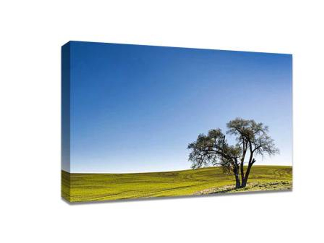
Ten Essential Tips for Perfect Landscape Photography Composition
Landscape photography is an art that requires both technical skill and a creative eye. Whether you’re capturing majestic mountains, serene lakes, or vast deserts, mastering composition can elevate your images and make them truly memorable. If you’re planning to showcase your work as a photo on canvas, understanding composition is key to ensuring your prints are visually striking and professionally appealing. Here are ten essential tips to improve your landscape photography composition.
1. Use the Rule of Thirds
The rule of thirds is one of the most fundamental principles in photography. Imagine dividing your frame into a 3x3 grid and placing key elements along the lines or at intersections. This creates balance and helps draw the viewer’s eye naturally across your image. For instance, place the horizon on the top or bottom third rather than the center to add depth and interest.
2. Include a Foreground Element
Adding a foreground element, such as rocks, flowers, or trees, can create depth and lead the viewer’s eye into the scene. This technique transforms a flat image into a three-dimensional experience, making your photo more engaging and dynamic.
3. Use Leading Lines
Leading lines guide the viewer’s gaze through the image toward the main subject. Roads, rivers, fences, and pathways are perfect examples. By incorporating leading lines, you create a sense of direction and movement that enhances the overall composition.
4. Mind Your Horizon
A crooked or poorly placed horizon can distract from an otherwise perfect landscape. Ensure the horizon is straight and strategically positioned based on the scene. Use it to balance the foreground and sky, emphasizing the most compelling parts of your landscape.
5. Explore Different Perspectives
Don’t settle for the first angle you find. Experiment with low angles, high vantage points, and side perspectives. Changing your perspective can reveal unique compositions and make familiar landscapes feel fresh and exciting.
6. Frame Your Subject
Natural frames like arching trees, window-like openings, or rock formations can draw attention to the focal point of your photograph. Framing adds context and depth, helping the viewer focus on the most important aspects of the scene.
7. Simplify the Scene
Avoid clutter by removing unnecessary elements that may distract from the main subject. A simplified composition ensures clarity and impact, allowing viewers to appreciate the beauty of the landscape without visual confusion.
8. Pay Attention to Light
Lighting dramatically affects mood and composition. Golden hour—the hour after sunrise and before sunset—provides soft, warm light that enhances textures and colors. Shadows and highlights can be used creatively to add dimension and emphasis.
9. Balance Your Elements
A well-balanced photograph distributes visual weight evenly across the frame. Balance can be symmetrical or asymmetrical but should always feel harmonious. Avoid placing all elements on one side unless used intentionally for artistic effect.
10. Capture Movement When Appropriate
Incorporating motion, such as flowing water or moving clouds, can add energy and dynamism to your landscape photos. Use slower shutter speeds for smooth effects or faster speeds to freeze action, depending on the mood you wish to convey.
Mastering these ten composition techniques not only enhances your photography skills but also ensures your images look stunning when printed. High-quality photo on canvas allows you to bring your landscape shots to life, preserving their depth, color, and impact. Whether for home decor, gifts, or gallery displays, a well-composed landscape photo becomes a timeless piece of art when printed on canvas.
By practicing these tips consistently, you’ll develop an intuitive sense of composition that elevates every landscape you photograph. Remember, great landscape photography isn’t just about the camera or lens—it’s about seeing the world in a way that tells a story and evokes emotion.
Recent Posts
-
Canvas Printing for Artists: How to Prepare Artwork for Large-Format Prints
Artists often want to turn their digital or traditional artwork into large-format prints for display …25th Apr 2026 -
Enhancing Your Home Office with Canvas Prints: Why Ordering Online Is the Smart Option
Working from home has become more than just a trend; it’s a lifestyle. As many of us continue to wor …24th Apr 2026 -
How to Arrange a Canvas Wall Art Display Like a Pro
Creating a visually appealing wall art display is one of the most effective ways to elevate your int …23rd Apr 2026
