Minimalist Landscape Photography: Transform Your Space with Stunning Canvas Prints
Minimalist landscape photography captures the essence of nature with simplicity and elegance, focusing on clean lines, muted colors, and uncluttered compositions. For art enthusiasts and home decorators, transforming these captivating photographs into canvas prints can dramatically enhance the ambiance of any room. Canvas prints not only preserve the sharpness and depth of the original photograph but also offer a tangible, lasting piece of art that complements modern, minimalist interiors.
What is Minimalist Landscape Photography?
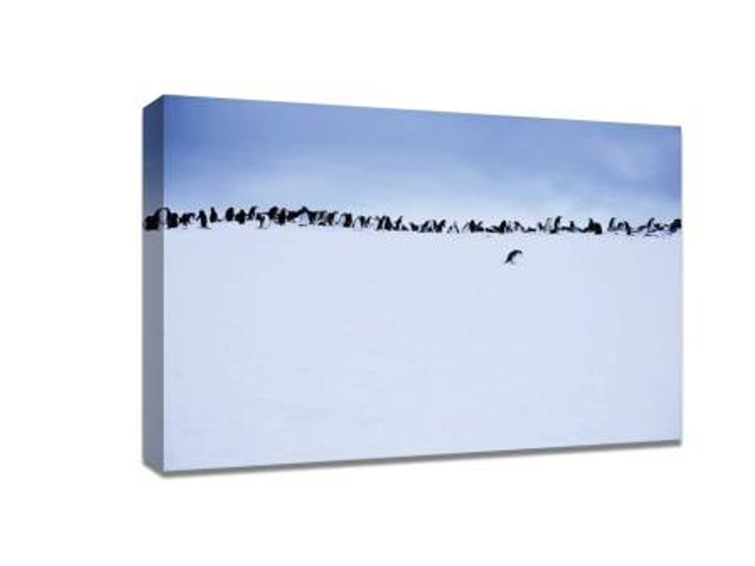
Minimalist landscape photography is more than just a style—it’s a philosophy. By stripping away unnecessary elements, the photographer emphasizes mood, light, and space. The focus is often on a single subject, whether it’s a lone tree, a solitary mountain peak, or a calm body of water. Negative space plays a crucial role, allowing the viewer’s imagination to fill in the gaps and creating a sense of tranquility.
The power of minimalist landscapes lies in their ability to evoke emotion with very little visual information. Unlike busy cityscapes or heavily edited nature scenes, minimalist landscapes offer a serene, meditative experience that resonates with people seeking calm and clarity in their living or working spaces.
Why Canvas Prints Elevate Minimalist Landscapes
Printing minimalist landscapes on canvas brings the photograph to life in ways that digital screens cannot replicate. The textured surface of canvas adds depth, enhancing the subtle tones and contrasts that are characteristic of minimalist photography. Unlike framed prints behind glass, canvas prints create a soft, immersive experience without glare or reflections, making them ideal for bedrooms, living rooms, or office spaces.
Furthermore, canvas prints offer durability and longevity. High-quality inks resist fading, ensuring that the peaceful beauty of the photograph remains vibrant for years. Canvas also provides a tactile, handcrafted feel, making each piece a statement of personal taste and style.
Selecting the Perfect Minimalist Landscape
Choosing the right minimalist landscape photograph for your space involves understanding the mood and color palette of the room. Here are some key considerations:
-
Color Harmony: Select photographs that complement your existing decor. Neutral tones like soft grays, muted greens, and sandy beiges work well in minimalist interiors. Bold contrasts, such as black-and-white landscapes, create striking focal points.
-
Subject Matter: Consider what draws you emotionally. Some prefer wide-open plains that evoke freedom, while others are drawn to solitary trees or mountains for contemplation.
-
Size and Scale: The size of your canvas print should match the space. Large prints work beautifully above sofas or beds, while smaller prints can create a gallery wall with multiple pieces.
Display Tips for Maximum Impact
To get the most from your minimalist landscape canvas prints, consider these display strategies:
-
Single Statement Piece: A large, solitary canvas print can serve as the centerpiece of a room, commanding attention without overwhelming the space.
-
Gallery Wall: Group several smaller prints together. Arrange them with equal spacing to maintain a sense of balance and simplicity.
-
Lighting Matters: Soft, diffused lighting enhances the textures and depth of your canvas. Avoid harsh spotlights that create glare.
-
Complementary Decor: Keep surrounding decor minimal. Neutral furniture and subtle accents allow the artwork to remain the focal point.
Benefits Beyond Aesthetic Appeal
Minimalist landscape canvas prints offer more than visual enjoyment. They can positively affect mental well-being by creating a calming environment. Studies suggest that exposure to nature imagery reduces stress, improves focus, and enhances overall mood. Whether in a home office, bedroom, or commercial space, these prints can contribute to a more serene and productive atmosphere.
Caring for Your Canvas Prints
Maintaining the beauty of your canvas prints is simple:
-
Dust Regularly: Use a soft, dry cloth or a gentle brush to remove dust.
-
Avoid Moisture: Keep prints away from damp areas to prevent warping or mold.
-
Direct Sunlight: Limit prolonged exposure to direct sunlight to preserve colors.
-
Handling: Always hold by the sides when moving to avoid stretching or damage.
Final Thoughts
Minimalist landscape photography, when printed on high-quality canvas, is an investment in both art and atmosphere. The combination of simplicity, emotional resonance, and timeless beauty makes these prints a perfect choice for anyone looking to enhance their interior design while enjoying the calming influence of nature.
By choosing canvas prints, you not only bring the photograph to life but also create a space that reflects your personal taste and appreciation for understated elegance. Whether you are decorating a modern apartment, a cozy home, or a professional office, minimalist landscape canvas prints are a versatile and stylish solution that will remain a treasured part of your decor for years to come.
Recent Posts
-
Personalized Canvas Photo Prints for Weddings: A Lasting Keepsake
Your wedding day is one of the most memorable moments of your life—a day filled with laughter, love, …8th May 2026 -
Cheap Canvas Prints: The Secret to Affordable Wedding Gifts
When it comes to wedding gifts, finding something meaningful, memorable, and budget-friendly can fee …6th May 2026 -
10 Creative Ways to Use Custom Ceramic Coasters at Home
Custom ceramic coasters are not just a functional item to protect your furniture; they can also serv …30th Apr 2026
