Mastering Landscape Photography Composition
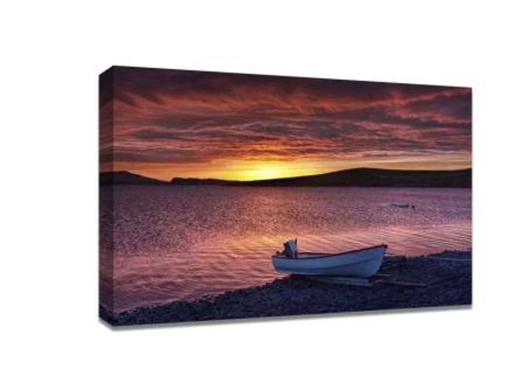
When it comes to capturing breathtaking landscapes, composition is the foundation that transforms a simple photo into a work of art. A well-composed shot can tell a story, evoke emotion, and make viewers feel like they’re standing right there in the scene. Once you’ve captured that perfect moment, you can bring it to life in your home or office with canvas prints online, allowing your art to be admired in vivid detail for years to come.
In this guide, we’ll explore the essential principles of landscape photography composition—helping you move from snapping casual shots to creating frame-worthy masterpieces.
1. Understanding the Importance of Composition in Landscape Photography
Composition is the arrangement of elements within your frame. It’s the blueprint that guides the viewer’s eyes and tells them where to focus. Without strong composition, even the most beautiful scenery can appear flat or uninspiring.
Great composition achieves three things:
-
Focus – It directs the viewer’s attention to the subject or focal point.
-
Balance – It creates harmony among all elements in the frame.
-
Storytelling – It communicates a mood, narrative, or atmosphere.
2. Master the Rule of Thirds
The rule of thirds is the cornerstone of composition. Imagine your frame divided into nine equal rectangles with two horizontal and two vertical lines. Placing your subject or horizon along these lines—or at their intersections—creates balance and visual interest.
For landscapes:
-
Place the horizon line on the upper third if the foreground is more interesting.
-
Place it on the lower third if the sky is dramatic.
This simple shift can turn a standard photo into a compelling scene that draws the viewer in.
3. Use Leading Lines to Guide the Viewer
Leading lines are natural or man-made elements that direct the eye toward the main subject. They could be winding roads, rivers, fences, or even shadows.
Tips for using leading lines in landscapes:
-
Position yourself so the line begins in the foreground and leads deeper into the image.
-
Use them to create a sense of movement and depth.
This technique helps viewers feel like they’re walking into your photograph.
4. Frame Your Scene Naturally
Framing uses elements within your environment to create a border around your subject. Examples include tree branches, archways, rock formations, or windows.
Benefits of natural framing:
-
Adds depth and context to the shot.
-
Draws focus directly to your subject.
-
Helps tell a story by including surrounding elements.
5. Pay Attention to Foreground Interest
Many amateur photographers focus only on the distant view, forgetting the importance of the foreground. Adding interesting elements in the foreground—like flowers, rocks, or textured ground—adds dimension and layers to your image.
A strong foreground can also lead the viewer’s eyes toward the background, creating a journey within the frame.
6. Use Symmetry and Reflections
Symmetry creates a sense of order and calmness, while reflections add intrigue and artistic flair. Bodies of water like lakes or puddles are perfect for capturing mirrored landscapes.
Pro tips:
-
Ensure your horizon is perfectly straight to maintain balance.
-
Try shooting during calm weather for the clearest reflections.
7. Apply Depth and Scale
Landscape photography isn’t just about capturing wide views—it’s about showing perspective. Including people, animals, or structures can give viewers a sense of scale, making the scene feel grander.
You can also create depth by including layers—foreground, midground, and background—making the image feel three-dimensional.
8. Experiment with Negative Space
Negative space refers to the empty or uncluttered areas in a photo. In landscapes, this could be a clear blue sky, a wide stretch of ocean, or an open field.
Why it works:
-
Highlights your subject by giving it “room to breathe.”
-
Creates a minimalist, dramatic effect.
9. Timing is Everything: Golden and Blue Hours
Lighting can make or break a landscape photo.
-
Golden hour – The hour after sunrise or before sunset gives warm, soft light and long shadows.
-
Blue hour – The period just before sunrise or after sunset offers cooler tones and a tranquil atmosphere.
These times provide the most flattering natural light, reducing harsh shadows and enhancing colors.
10. Break the Rules (Once You Know Them)
Rules are guidelines, not rigid laws. Once you’ve mastered them, experiment with breaking them to create unique, artistic shots. Sometimes placing your subject dead center or shooting at unconventional angles can produce captivating results.
Bringing Your Landscapes to Life
A beautifully composed landscape photo deserves more than just digital storage—it deserves to be displayed. Printing your best shots as high-quality canvas prints online allows you to preserve their vibrancy, texture, and emotion. Whether hung in your living room, office, or gifted to someone special, canvas prints transform your photography into lasting art.
By applying these composition techniques, you’ll not only improve your skills behind the lens but also create images worth showcasing in any space. Remember—landscape photography is about patience, perspective, and passion. With practice, you’ll find your unique style and capture scenes that truly speak to the heart.
Recent Posts
-
Cheap Canvas Prints: The Secret to Affordable Wedding Gifts
When it comes to wedding gifts, finding something meaningful, memorable, and budget-friendly can fee …6th May 2026 -
10 Creative Ways to Use Custom Ceramic Coasters at Home
Custom ceramic coasters are not just a functional item to protect your furniture; they can also serv …30th Apr 2026 -
The Importance of Color and Resolution in Picture-to-Canvas Printing
When it comes to transforming a cherished photograph into a work of art, canvas printing is a popula …30th Apr 2026
