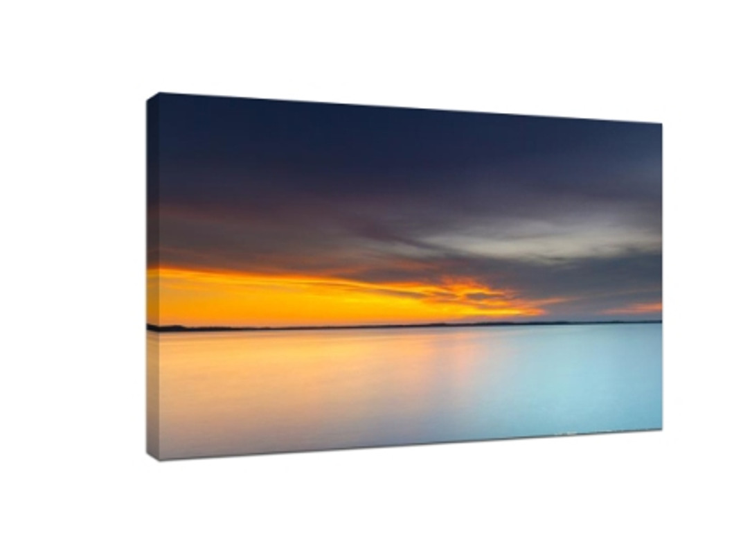
12 simplicity photography tips
First, shot scenery, blank, simple, Contrast.
A blank sheet of paper is simple, but it doesn't look good. For example, although the light and shadow in the following picture are beautiful, there always seems to be something missing. This is because he intended to use blank space to express simplicity, but the result shows simplicity. We can use contrast to highlight the simplicity of photos:
Second, take scenery: color unification, but have excessive.
When shooting scenery, it is not necessary to have a point or several points, but often there can be many lines, or other small parts of the picture. But if you want to keep it simple, here's the thing:
Third, home simple photography skills: less is simple. Light and shadow increase three-dimensional sense, more simple. We can also take a simple picture of the home environment, but only reduce the picture elements, which often reflect the simplicity, such as the following picture:
Fourth, shoot plants: clean background is simple?
Do photos with clean backgrounds look more minimalist? I don't think so. For example, in this photo of plants, the background is clean, but the foreground subject is disconcerting and annoying. At the same time, because the plant is too close to the four edges of the full picture, the picture reflects the tension, but at the same time, it is more chaotic. The following two photos are also of wantonly growing trees, brandishing their teeth and claws, but:
Fifth, clap a tree: is the background open space contracted?
The background is empty, does the photograph appear much contracted? I don't think so. For example, in the following photo of trees, although the background is very empty, the color of the background is not pretty. The gray fog does not reflect the feeling of immortal spirit, but makes the picture very dirty. When the background is relatively empty, we should pay attention to:
Sixth, Architecture: Local regularity is not important, but overall cleanliness is the key.
The following architectural photo, horizontal and vertical, square frame, look very simple, but put together, because there is no rule, but more chaotic. And here's the picture:
Horizontal flat vertical, rich in color at the same time, and there is a certain law, color, but not chaotic, by the rules, rules of the restrictions, contracted feeling reflected. In this case, one or more people appear in a box in the picture, which is even better.

Seventh, take architecture: black and white is best.
If you want to photograph simplicity, there is a very good way to do it:
Take black and white photos, and only take the parts above the tall buildings, because the overall picture has fewer elements, edges and corners, rules and regulations, and is simple but not simple.
Eighth, take architecture: contrast is also easy to use, the truth is the same.
If you want to enrich the architectural photos and overall picture, you can also select buildings with characteristic colors from a distance for shooting. The trees on the ground form a good contrast with the buildings, and at the same time, trees can be used to shield cars and people to prevent them from causing chaos.
Ninth, the overall simplicity is important, the main flaw is more important!
In the picture below, there are only two elements in the picture, the grass in the background and the leaves in the foreground. Although the whole picture is simple, the main body has obvious flaws, and the main body is neither beautiful nor beautiful. Simplicity should be based on the beauty of the main body. If there are obvious flaws in the subject, this photo is a dead one. The maple leaf is also taken in the following picture:
Can you use solid color background?
Solid color background will make the photos feel simple, not good use will let people feel simple, then how to use it well?
Note the echo, note the white space. In the following picture, the color in the middle of the sunflower echoes the color in the background. The white space above the sunflower makes the photo look very loose and appropriate.
Eleventh, details out of the simple, you will?
We can also shoot plants with larger, flawless leaves, spray some water droplets, use a macro, get the lens close to the subject and shoot the texture on them. Whether you're using a macro lens or using the phone's macro mode, you need to be close enough to get a better focus and a clearer picture.
Twelfth, virtual, solve all difficult diseases!
It helps us get rid of clutter that we don't need, and in photography, it solves almost all of the clutter that we encounter. You can use the telephoto end of the telephoto lens, or you can use the large aperture lens, the phone can use the large aperture mode, or portrait mode, to take a blur! Contracted is not equal to simple, from literal understanding, simple is the structure is pure, sloppy, not meticulous, contracted more brief, more relaxed, let a person feel more comfortable. The meaning of photography works is also different, simple, just simple, while simple works, on the basis of simplicity, can better reflect the photographer's ideas.
Recent Posts
-
Why Perspex Sheets Are Ideal for High-Quality Digital Prints
In the world of modern printing, perspex printing has become an increasingly popular choice for high …17th Apr 2025 -
Top 5 Benefits of Using Custom Ceramic Coasters Over Other Materials
When it comes to protecting your furniture from water rings, spills, and stains, coasters are essent …17th Apr 2025 -
Cheap vs. Expensive Canvas Prints: Is It Worth Paying More?
When it comes to decorating your home or office, canvas prints are a popular choice. They offer a be …17th Apr 2025
